There’s nothing like colour to bring your living room to life and give your interior a quick make-over. Need some inspiration? Here are the most popular colours of 2023 and some tips on how to use them.
What colours are on trend for a light living room?
In 2023, light colours are taking centre stage for maximising light and softness. We are falling for pastel colours: green, pink, violet, yellow, or blue... The choices are endless. Equally trendy is beige - the ‘new white’ – to bring softness and warmth to your living room.
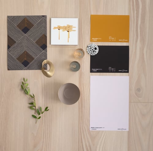
If you prefer a contemporary, vibrant style instead, paint your walls in an airy, floral violet pastel, and combine it with a darker floor decor (in warm or grey tones). Shades of cream, beige, vanilla, and black are an excellent choice for furniture and decoration. Last but not least, copper-coloured accessories are the perfect way to add sparkle to purple pastels. Alternatively, you could combine purple pastels with a crimson red accent or with beige and pink to bring the fantasy-rich 80s back to life. This goes perfectly with a light, greyish floor.
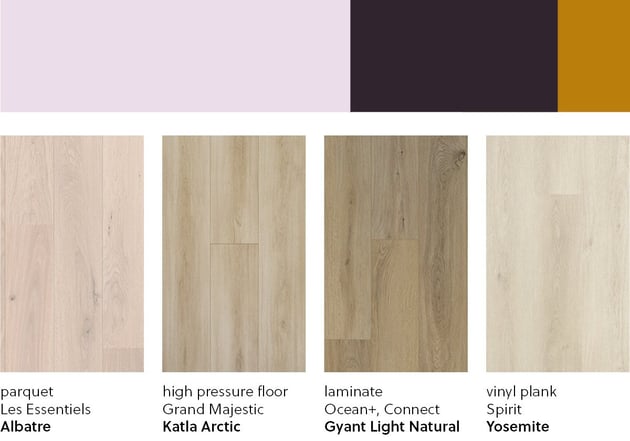
Moodboard : Laminate - Ocean+ & Connect - Ragnar Light Sand
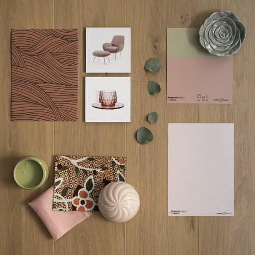
JCoffee table Nanook Morosa / Wallpaper Lalique Ondes 7447 11 32 from Casamance
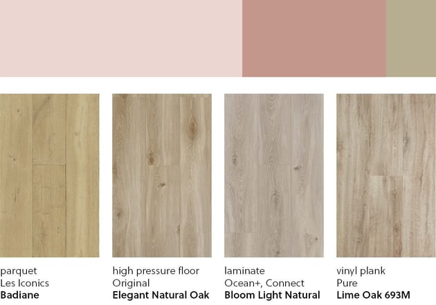
Pastel pink is also very popular. As a soft and refreshing colour, it adds a cosy atmosphere to your living room and goes well with other pastel colours too. And to make your living room even lighter, combine it with a natural oak floor from BerryAlloc. You can also pair pastel pink with sage green, a fabulous colour that’s very much on trend.
In a refined interior with pop and arty accents, pastel pink is embellished with red, orange, black, dark pink, or even gold-green accents. Finish things off with a touch of copper! A light parquet floor with a red or green undertone will make your furniture pop. For a more classical style, combine soft pink with light green, blue, white, and a light wood floor with a yellow undertone.
Moodboard: Parquet - Les Exclusifs - Lagune Naturel
Moby chair (Made) / Jellies Patricia Urquiola (Kartell) / Fabric Rosewood (Blanc des Vosges) / Textile Rio OD 119 51 (Elitis) / Wallpaper Alula Terracota A74360518(Casamance) / Paintings Toulouse, Genius of the place (Nacarat) – Green of the fountains
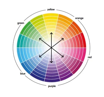
To make the most of a trend colour, it is best to work with harmonious colours or complementary contrast colours (opposite shade on the colour wheel).
How to match the wall colour to the furniture and floor in the living room?
Trend colours do not necessarily have to dominate a space. They can be supported by an eye-catching piece of furniture (a sofa, a dresser, a bookshelf, or a standing lamp) or by accessories. Colourful furniture adds character to the living room and highlights its personality. Another option is to apply colour to a single wall or choose a floor with a specific colour or undertone. For example, a light coloured floor with a red undertone, combined with grey furniture and fixtures in copper or marble, will result in an interior that looks both modern and elegant.
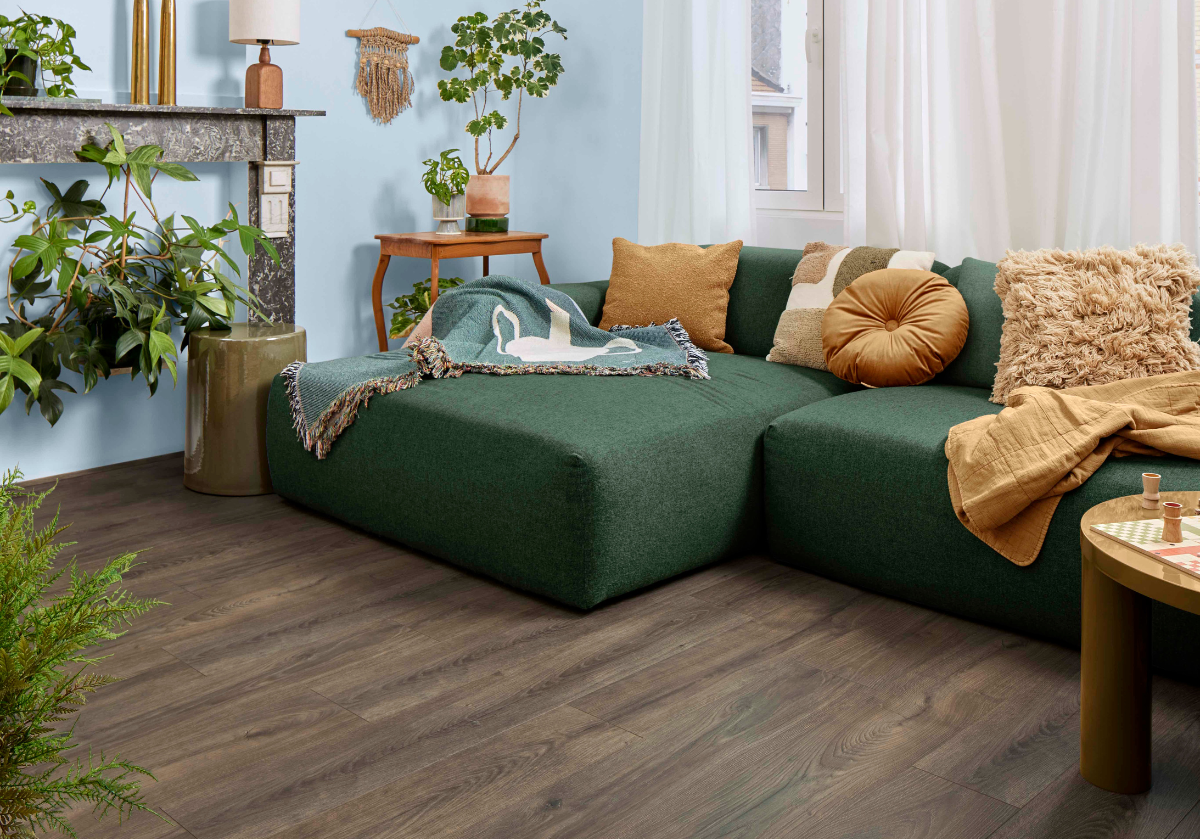
Introducing colour in your living room is mostly a matter of balance and harmony. To achieve an impeccable end result, we recommend applying different hues of the same colour, from the lightest to the darkest, to the floor, walls and furniture. Green tints create harmonious colour-on-colour effects. We would also incorporate various materials, bringing together a combination of wooden flooring, a velvet sofa, wicker dressers, metal tableware, brass fixtures, and so on.